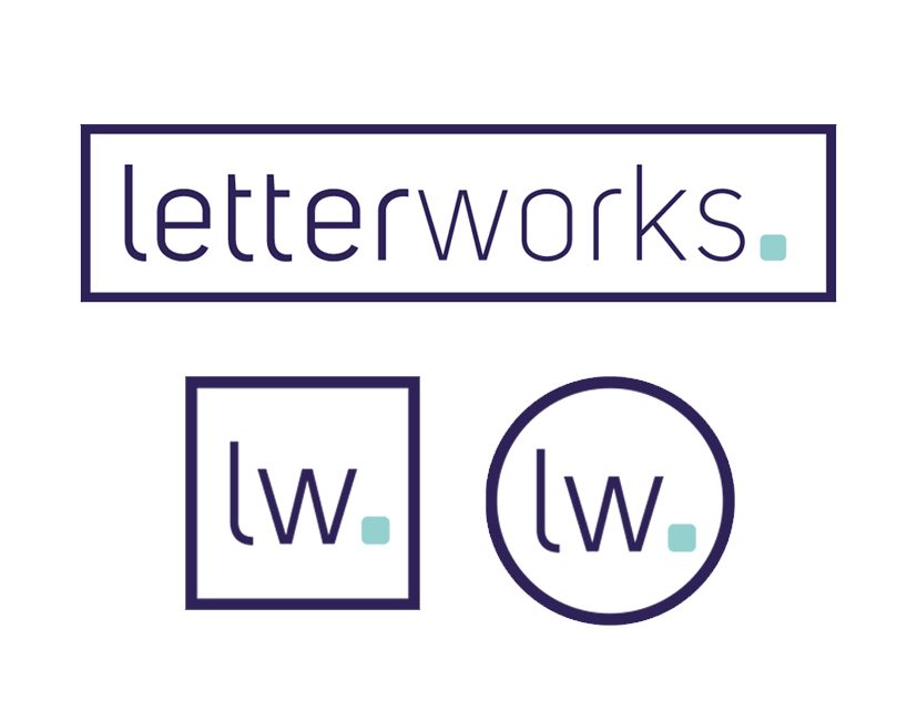
letterworks recently commissioned Nicola Dillon, a London based designer, to completely redesign our logo and corporate id. Keen typophiles, we wanted to ensure our logotype was made the heart of the design and after what seemed like hundreds of typeface proofs, we decided that Uni Sans was the font for us. Uni Sans is a modern sans serif font, designed by Svetoslav Simov in 2009. Once we bought the full font family, Nicola set about making the individual letter tweaks and kerning the wordmark to perfection.
We decided upon a fullpoint at the end. This is in the form of either a square pixel (as used in digital screens) or a round dot (as found in print). Sharp eyed people may notice the different elements on different products.
Finally, the wordmark was framed. It was a happy coincidence that it resembled the shape of a keyboard, which, of course, is as essential to our studio, as it gets!


